How to Design a Beautiful (and Meaningful) Instagram Feed
New Year, new social strategy? For many of us, Instagram has become a part of our lives, so the idea that we are always striving to improve it doesn’t seem so crazy after all.
When I completed my annual poll on Instagram stories at the end of 2018, I received feedback showing increased interest in the behind the scenes of how I run my blog and social media. If you are reading this post, it probably means that you yourself have some curiosity surrounding Instagram curation.
The burning questions of “how do you grow?”, “how do you get noticed?”, and “how do you make money?” truly all begin with the design of a beautiful and meaningful Instagram feed. Having a high-quality feed that adds value to your community and audience is key to thriving in this creative industry.
Now, of course everyone is unique and is drawn to different things on social media. If you do not agree with this post and my tips, that is totally okay. I actually touch on the power of attracting and repelling further down because that is one of the tools I use when curating my own Instagram feed. If you are trying to attract everyone, you are likely engaging no one.
Today I’m breaking down choosing a theme and color palette, defining your purpose, shooting content for your feed, grid planning, writing captions, and more.
If I missed a topic surrounding Instagram that you want to hear more about, comment on my latest post and tell me!
Choose a theme or color palette
Branding plays a huge role in designing a beautiful Instagram feed. If you are not consistent with your messaging and colors, it can be very confusing for your audience. Imagine if a makeup brand you loved had an Instagram that went from dark and edgy to feminine and light on a day-to-day basis. Rather than attracting and repelling by sticking to one theme, they are trying to reach everyone and, as a result, are likely not connecting with anyone.
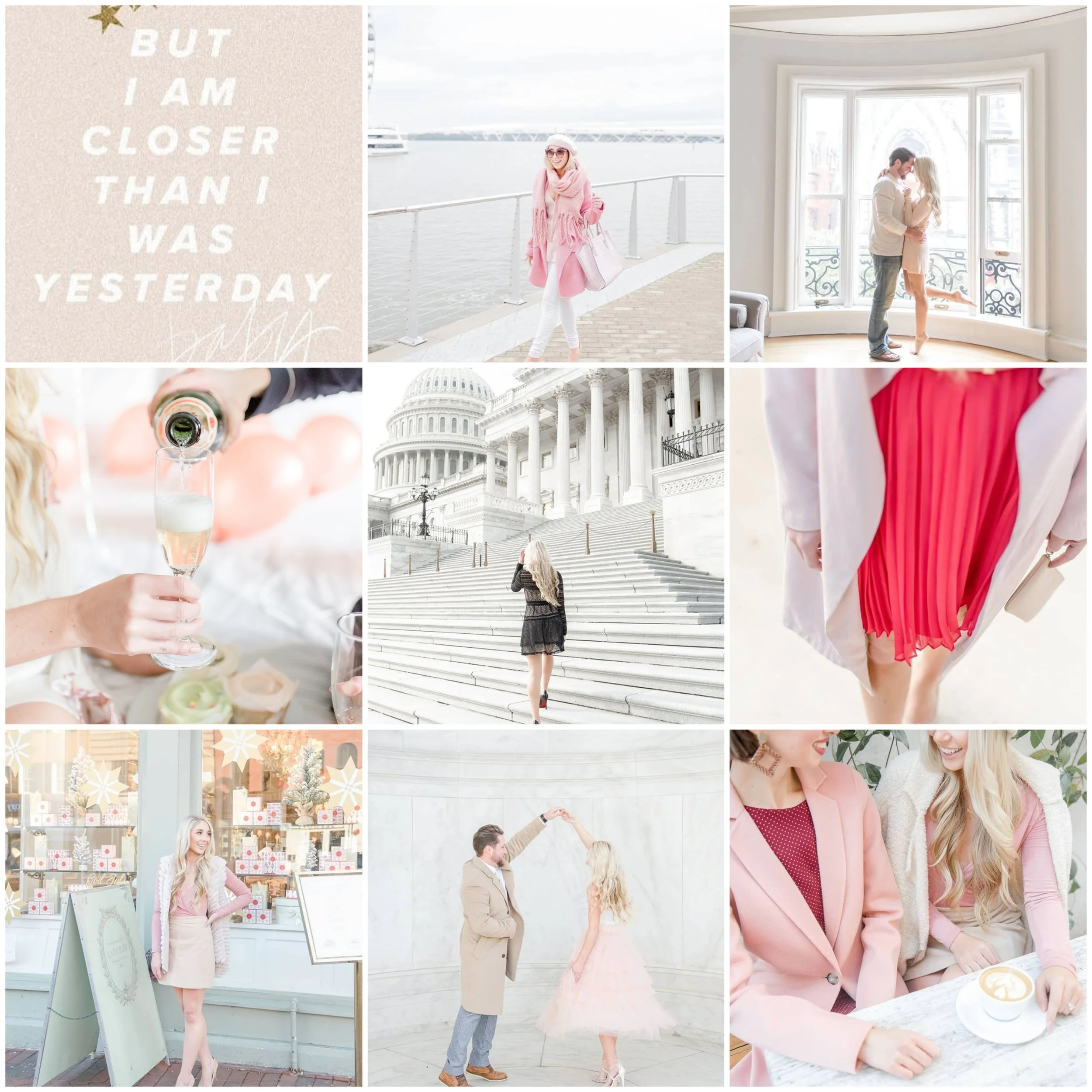
A personal example from my own feed is my pink theme. Of course, not everyone is into blush pink everything. I’ve been told that my feed is “boring”, “too girly”, “too styled”, and that my photos “all look the same”. Guess what, though? Those aren’t my people. I’m not trying to please everyone because that would literally drive me crazy and probably wouldn’t make my job very fun. Instead, I am attracting my tribe; the girls that LOVE pink. I’m attracting a community of women that are optimistic, feminine, and lift each other up all the while rocking a cute mini dress and classic pumps.
My goal is to design a brand that is recognizable and unique to me. When you are scrolling through your feed and my photo pops up (even if I’m not in it), I want you to immediately identify it as mine through the colors, photography style, and writing without glancing at the name. To me, that is successful branding.
What is your theme? Do you have a signature color that makes your besties think of you when they go shopping? What do you feel yourself drawn to in your home, on Pinterest, at restaurants? What do you feel most confident rocking on a day-to-day basis? Creating a secret Pinterest board with your favorite pieces of inspiration can be extremely helpful in determining what direction you want to take your Instagram feed in. P.S. this is how I discovered and refined my aesthetic when I re-branded a few years ago.
Shoot content that is consistent with your branding
I’ve been asked time and time again how I keep my Instagram feed so consistently pink. The honest and very simple answer is that I basically only shoot content wearing pink. I purposely shoot at bright locations, use natural light, and add some element of pink into my outfits. In the beginning stages of my blog, I wasn’t as aware of this so my style and branding was understandably all over the place.
For me, I don’t shoot in low-light settings, at events, or on-the-go. I know that it won’t be consistent with my feed and I truly prefer it that way, because rather than worrying about getting the “perfect shot” while out, I just enjoy being in the moment and posting spontaneously to Instagram stories instead.
Currently, 100% of my Instagram feed from the past several months is made up of shoots that I have planned and styled in advance. Of course, this takes time to scout locations, travel if necessary, track the weather and timing for my ideal lighting, and style each look using my signature color palette. But, that is how I personally prefer to create content. I get so excited before shooting a campaign that I’ve been styling for weeks that sometimes I can’t even sleep the night before. It feels like I’m running my own online magazine (aka my dream come true)!
This varies from person to person depending on their brand and aesthetic. I know plenty of bloggers who prefer to only shoot at evening events and on-the-go, and many of them do it successfully because they are consistent with it. My point here is to know what your brand is and to stick with it, even if that means restricting yourself from posting a photo that you might really enjoy, but doesn’t make sense for your feed. Save those for Instagram stories instead!
Use a grid planning app
I have been using the app, Planoly, for the past couple years. I have tested out a few others, but this is the one that I prefer because it gets straight to the point and has the features that I need. I believe it is $10/month, but I use it on a daily basis, so the cost is definitely worth it for me.
Designing a beautiful and consistent feed on Instagram is made much easier with a grid planning app. It allows you to see in advance how photos will look side by side rather than guessing, posting, and deleting (or settling). I spend a good amount of time each week in this app adding, removing, and shifting photos around until my feed is exactly how I want it to look.
Using an app like this also allows me to sync my Instagram feed with my content calendar for my blog, and to ensure that I’m not sharing the same type of content over and over again in the same sequence.
Syncing Instagram posts with my blog posts is crucial in driving traffic to my website and tying the two platforms together with a single topic for the day.
Also, switching up your posts to your feed is important to serve your audience best and provide value on different topics. For example, if one person is following me for relationship posts and another is following for fashion posts, I want to make sure that I am serving them both by switching it up rather than posting all photos of Sam and I for one week, and all outfit photos for the next week. My main topics that I try to touch on throughout each week in my Instagram feed are: relationship, fashion, motivation, collaborations with other women, and styling brand photography.
Schedule time to write meaningful captions that are consistent with your purpose and tone
Along with your theme and color palette, you should be distinctly aware of WHY you are posting, WHO you are talking to, and HOW you are communicating with them. Feel free to pause here and write these things down if you are feeling a little unsure.
One of the best pieces of advice I’ve received in this industry is, “Each time before you post, define your ‘why’. Is it self-serving? To boast or to talk for the sake of talking? If so, pause and re-frame.” If you are not inspiring, teaching, motivating, or entertaining your audience, then what is the point?
I schedule time in my calendar every week to sit down and write out Instagram captions so I’m not stressed on-the-go or throwing something together last minute when I need to post.
Secondly, your tone should remain consistent throughout your feed so that your audience can hear your voice when they read your captions. If you’re switching from “Hey, babes” to “Greetings, fellow women”, it’s probably going to come off as inauthentic and confusing to your audience. Personally, I write my captions based on how I speak and I keep my tone casual and conversational to match my blog posts and other social platforms.
Last tip: always have a clear “ask” within each caption to keep your audience engaged with your content rather than continuing their scroll. It can be a question to spark conversation in your comments, a request to click on the link in your bio to read more or subscribe to your newsletter, tagging a friend, etc. Just make sure that when they finish reading your caption they are clear of what step you want them to take next.
Want more lifestyle inspiration? Read Our Girls’ Weekend Away in DC and How We Had Our Dream Wedding on a Budget.
Do you use these strategies to curate your Instagram feed? Comment on the last photo on my Instagram and tell me, or tag me in your favorite post so I can check out your feed!
Lastly, do you want some inbox love? Get the special treatment: exclusive content, sales I'm loving, new blog posts, social media, & more. Join our email list now!
xo Anna Elizabeth


